The New
Achimotafund.org
Achimotafund.org
Website for a non-profit foundation dedicated to the Achimota School located in Accra, Ghana.
After the successful design of the first version of the website, plans and initial sketches had been made to continue with a more modern web presence with live chat features and a dedicated donation area. The new design was to be a cleaner and more direct call to action to help the Achimota Fund.

The About Us page with background information as well as school songs and a brief campus history.

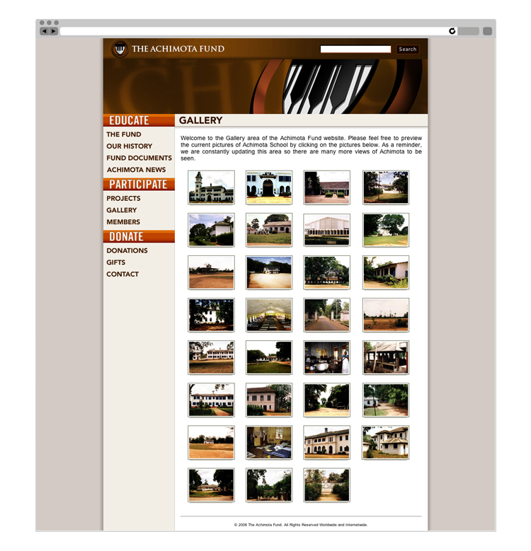
Gallery page with dynamic lightbox photo previews to give alumni a look at the state of the campus grounds.

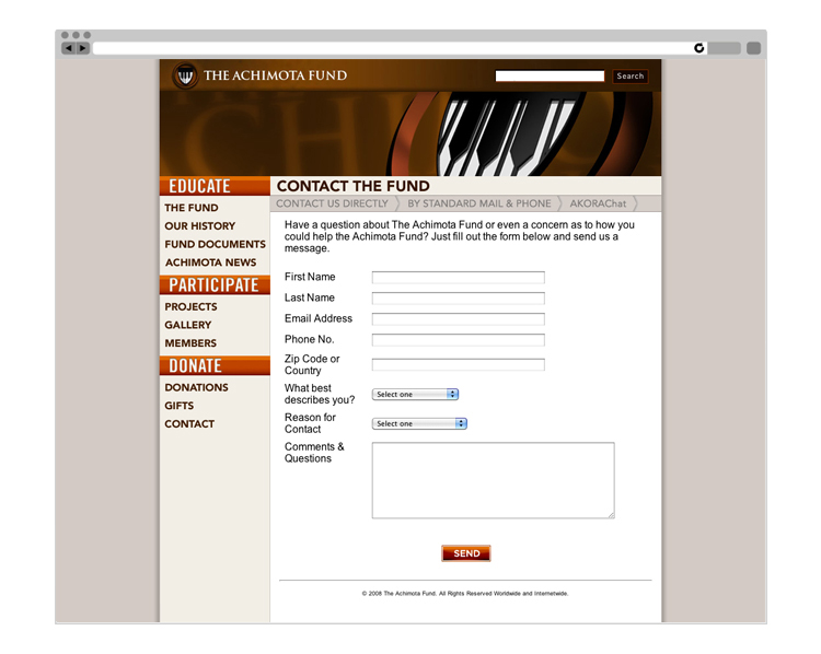
Contact page with three tier system of correspondence. Alumni could reach the fund via contact form (shown above), standard mail and a live web chat service dubbed "AKORAChat".

