
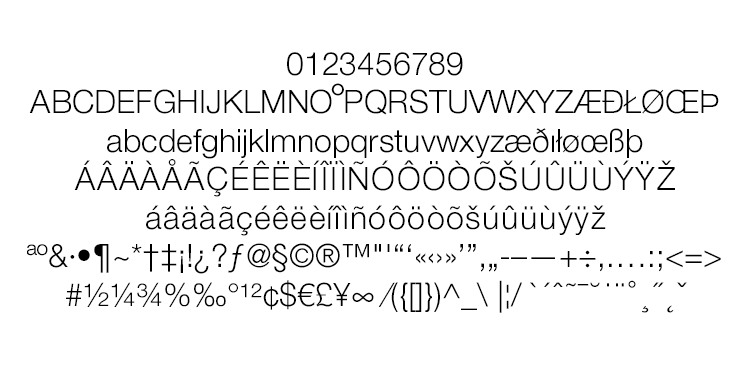
Rheem Sans
Sans serif typeface family developed in collaboration with design agencies BRR Atlanta, Denmark [the Agency] and The Rheem Manufacturing Co.
Spanning two separate ad agencies and a combined year of development, The Rheem Sans typeface family was a real test in creating a functioning six member font family with our type design department, AKOFAType.
The challenge came from agency requirements for a typeface family that should have both the distinct qualities of another popular typeface but also include a unique Opentype design feature customized for the marketing efforts of the client, The Rheem Manufacturing Company.
The challenge came from agency requirements for a typeface family that should have both the distinct qualities of another popular typeface but also include a unique Opentype design feature customized for the marketing efforts of the client, The Rheem Manufacturing Company.
Rheem Sans - Light
Rheem Sans - Light Italic
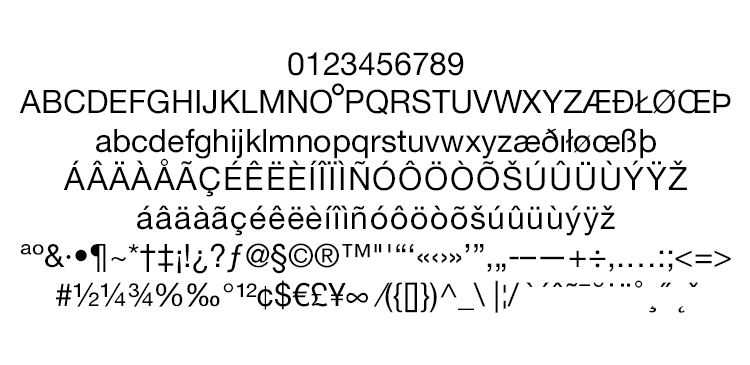
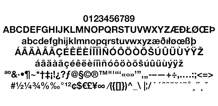
Rheem Sans - Normal

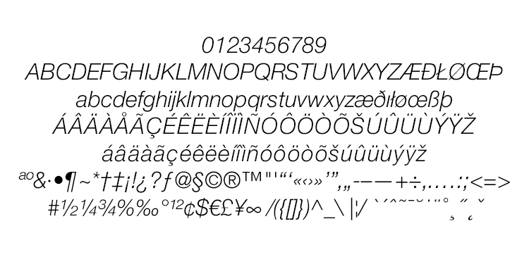
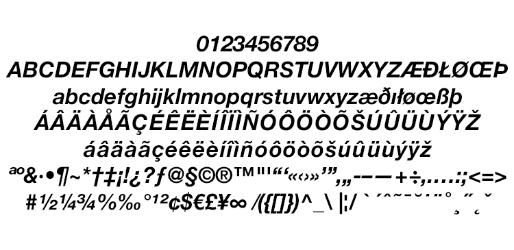
Rheem Sans - Italic
Rheem Sans - Bold
Rheem Sans - Bold Italic
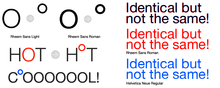
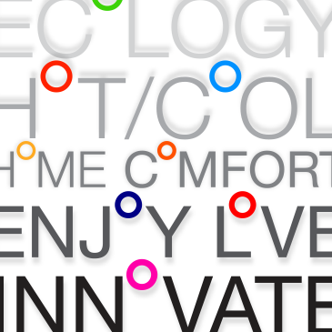
"O" Boy!
While most of the Rheem Sans family is developed to almost echo Helvetica, there is an extra added feature to the Light and Roman weights based on the client's request. The custom "degree O" was incorporated because of the clients marketing efforts and is a visual play on the use of a degree symbol to indicate temperature.
So Similar Yet So DIfferent
Because Rheem Sans and Helvetica share a common ancestor in Neue Haas Grotesk, you will surely see the same curvature and letter formation. What you won't easily notice is that the Rheem Sans family is a touch thicker in some areas where Helvetica is noticeably thinner. This was done for better visual stability and was on the shortlist of client requests.
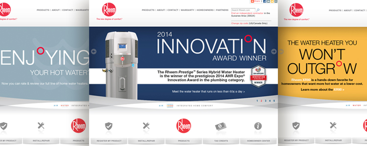
Rheem Sans applied to Rheem Manufacturing Co. web marketing material.